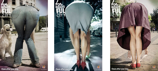
“For beautiful city” Belgrade campaign.

I’m sorry for McCann Erickson Belgrade (it’s not fair to criticize someone else’s work and I generally don’t do it), but sincerely I don’t like their sexy advertising campaign “for beautiful city.”
I don’t like it as a woman, but not a feminist, for obvious reasons (indeed the only subject with a man doesn’t work at all); I don’t like it as a person ’cause in those ads I feel something like an annoying discriminatory background. The city is more beautiful if men can see pretty butts but are we sure that they would be happy even if they would see, for example, fat or ugly ones? Or maybe the concept is that people with ugly or fat bottoms should leave their dog’s poop on the street to “preserve” beauty?
At last I don’t like “for beautiful city” campaign as a creative. Bill Bernbach (the Guru of advertising par excellence) taught: “don’t turn a man upside down in your ad unless you are selling me spill-proof pockets”. This means that sensational visuals work only if the sensational part is consistent with the core message. Otherwise – this is Bernbach again – we call it “Oddvertising”.
And here we are. McCann Erickson Belgrade campaign was the most viewed and clicked on the web: but are we sure that all the people who saw those ads will remember the message of the campaign? The man was turned upside down in reason? I think that the problem of this campaign is that in your mind remains the bottom. But not the poop.